How to avoid (and repair) these
critical design blunders
Duration: 3 MIN
Use your keyboard arrows
to view the story!
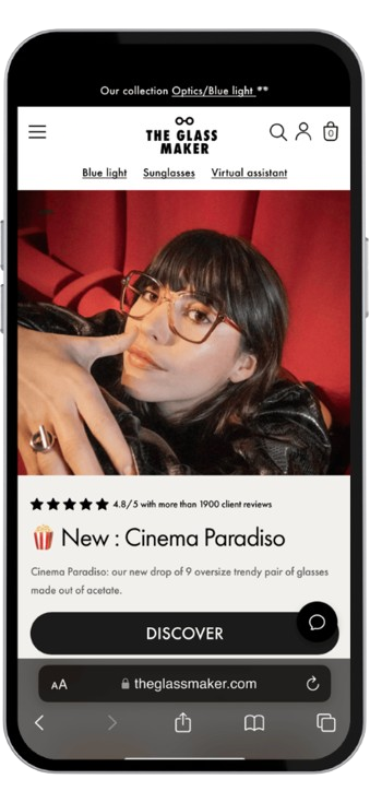
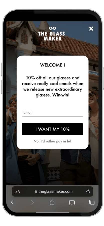
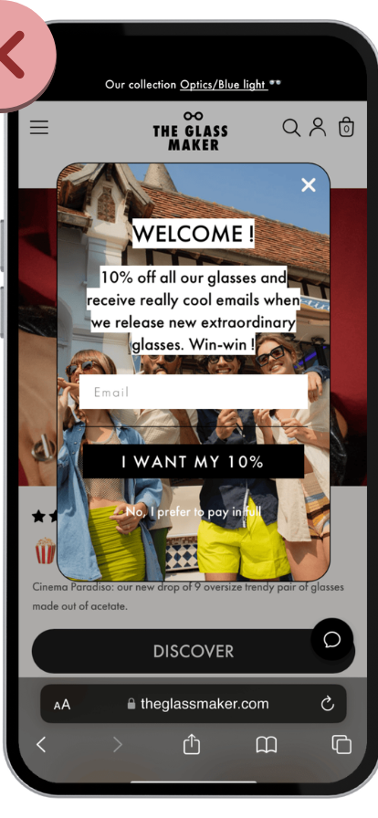
I was shopping for a new pair of blue-light glasses until—
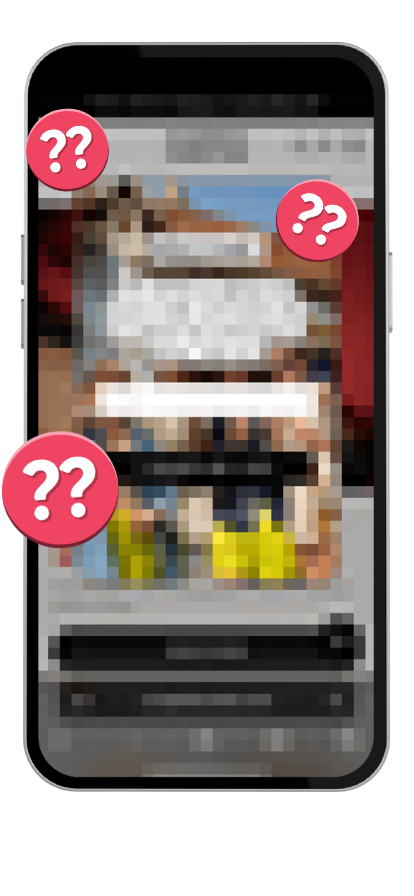
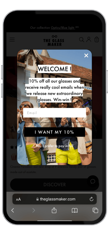
—this pop-up appeared...
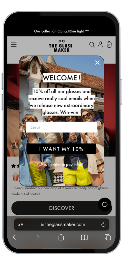
Oof...
This actually
hurts my soul...
So many colors and images... Plus—
—why are we shouting?!
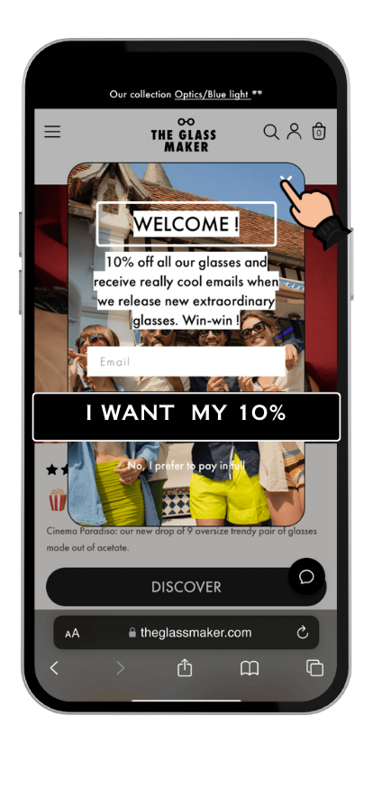
I was about to leave when—
—You know what?
Let's dissect this!
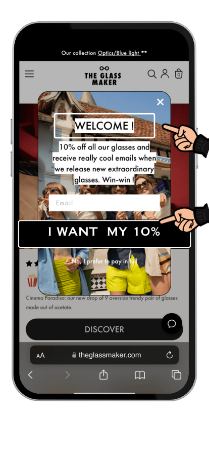
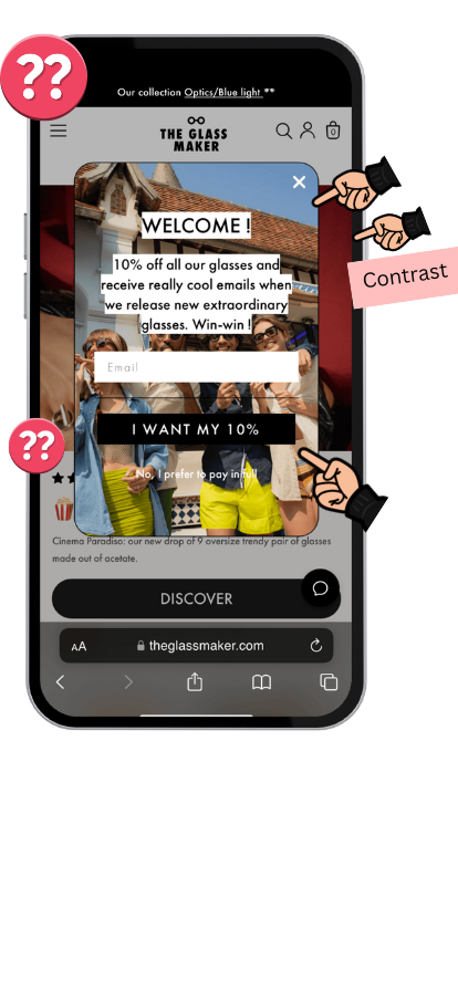
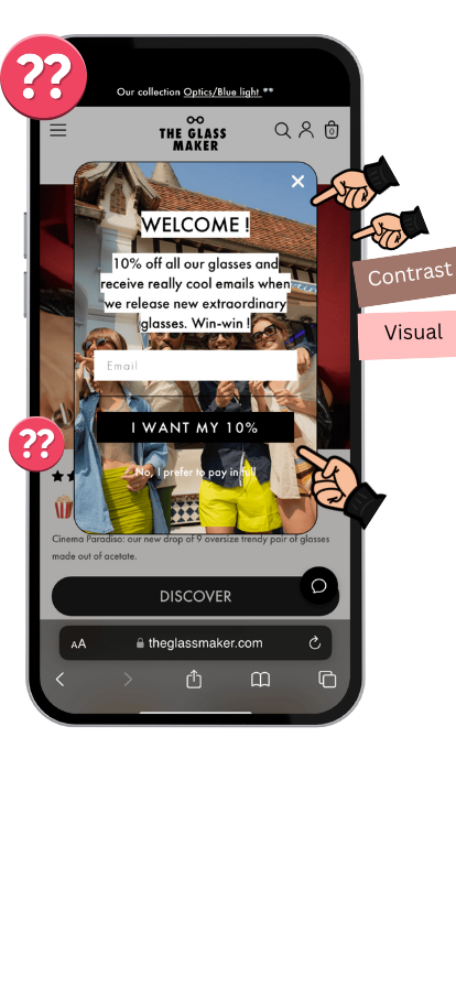
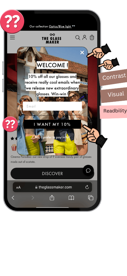
Can you spot the 3 critical blunders here ?
1. 🖼️ Lack of Contrast
The foreground and background compete with one another and even the CTA is hard to see.
2. 🥇 Missing Hierarchy
It's hard to focus on anything when everything pulls your attention (logotype, text in caps, photos, CTAs, etc.)
3. 🧐 Poor Readability
The white text over the image and the black text boxed in make it super hard to read.
And perhaps not a blunder, but the tone of voice is a bit over the top—
Contrast
Visual Hirerchy
Readability
Tone of voice
—"really cool emails" and even some user shaming
"I prefer to pay in full"...
Not a good look!*
Contrast
Visual Hirerchy
Readability
Tone of voice
Contrast
Visual Hirerchy
Readability
Tone of voice
#data insight
Good Design Is Good Business
Design influences about 80 percent of buying decisions and user satisfaction.1
Peter Zec’s research has proven that you can only succeed long-term with a well-thought-out design strategy.2
In this case, the opposite rings true. Bad design can be a sure loss.
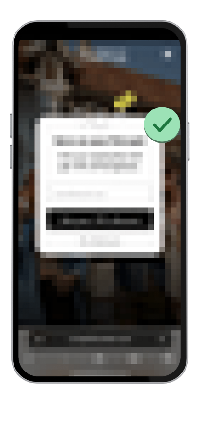
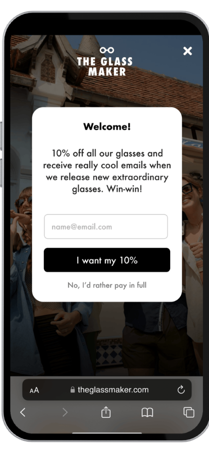
Now, how can we save this?
First, let's solve the background issue—
Finally! We can see something—
#Ux pro tip
Direct Focus With Contrast
Anytime you want visitors to focus on a specific question or task, use visual contrast to your advantage: 1.Reduce the visibility of secondary elements on the page.
2. Enhance the salience of primary elements.
Sometimes it’s that simple.
Now... The fun part. Let's expand that pop-up and—
—increase the overall readability...
Boom.
Also, let's remove the "shouting"—
Now, let's edit/cut some of the copy and —
—let's try to be less generic...
Voila!
The text is easier to scan and—
—you immediately see the benefits
you're getting!
#Ux pro tip
Direct Focus With Contrast
It’s easy to explain a concept with a lot of words. It’s a lot harder to explain that same concept with fewer words.
The same goes for UX copywriting. The fewer words, the better.
P.S. Never use “shaming” to create potential short-term results.2
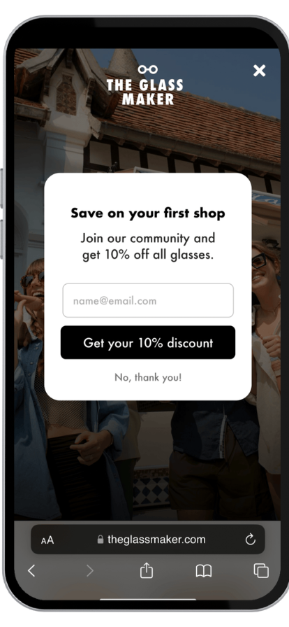
We could stop here, but...
It's somewhat easy to dismiss a generic discount. Everybody offers them nowadays... So—
—is there a better way to make this more tangible for visitors?
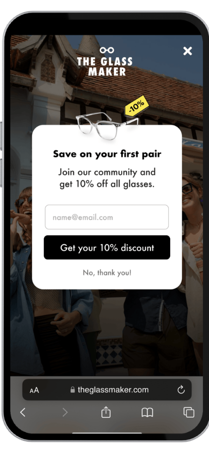
An actual pair of glasses!
#Psychology insight
Priming For Better Recall
Subtle visual suggestions help users recall specific information, influencing how they respond.1
Adding the glasses with a discount makes it much easier to recall something you liked while browsing, increasing the chances of converting.
And now, even if you don't know the brand, the offer is more specific and vivid...
Making this new pop-up—
—the original one!
Now, if you wish to apply these same psychology principles to your product:
1. Download this checklist
2. Check out our course